

1-844-COLOURS INC.
1-844-COLOURS
Professional services
Verbal branding
Brand Identity Design
Website Design
The Branding Objective
When starting out, 1-844-Colours, like all other companies, wanted a unique, catchy brand that would help the company become a household name. It also wanted to show the company as highly professional and able to deliver exceptional service with outstanding results.
In short, the brand needed to ooze trustworthiness and make customers want to hire them rather than the competitors. And the owners of this far sighted company had other crystal clear objectives about what they expected their brand to do:
• To intrigue potential clients and put a smile on their faces
• To be particularly appealing to women, knowing that most painting services in Canada are bought by women
Luckily for 1-844-Colours, not only did they have a strong vision of what they wanted from their brand, but they called in the experts at the very beginning.
Choice of Brand Development Company
The owners of 1-844-Colours chose New Design Group to develop their brand based on the company’s strong creativity which was clearly visible in previous brand development projects. They believed New Design Group could transform their ideas and aspirations into an effective brand design that would be hard to forget.
The Branding Concepts
The company owners were clear about the types of design they liked and also made specific mention that they envisaged a website rich in neutral or dark brown, rustic colours.
However a good brand design company, such as New Design Group, will be guided by the client but will not let the brief stifle creativity. Six different concepts were created for 1-844-Colours for consideration, and only one was rich in dark colours.
• The first concept was designed around an image of a feather, similar to a peacock’s although in pink and yellow, set atop a black background, displaying the bold colours perfectly.
• The second concept was completely focused on the company name, with the ‘O’ of 1-844-Colours designed more prominently than the remainder of the letters.
• The third design was based on a gentle rainbow of pastel colours which looks great on a white or black background.
• As a contrast to the previous design, this was based on strong primary colours: yellow and blue, and includes a simple illustration of a house.
• The next design was truly a multicoloured kaleidoscopic and features the silhouette of a humming bird – a creature associated in everyone’s mind with vibrant colour and beauty.
• The final concept was the most daring of all – let’s call it the Moustache concept.
The Moustache Concept
New Design Group’s Creative Director, Elena Loga, was well placed to understand the company’s objectives for the brand: she could appreciate what other women find amusing and as a talented designer, she understood how to create a design to intrigue the viewer. And so for her final concept, she decided to embark on a daringly different design.
Delving into her past, Elena recalled how as a child, she had always assumed that men with flamboyant moustaches were painters. And this started her creative juices flowing. A moustache is masculine but is can also define a man: think Clark Gable, Burt Reynolds and Tom Selleck, who are as well known for their moustaches as for their thespian skills. Moreover this quirky strip of upper lip facial hair is currently en vogue and is the focus of Movember – when men grow moustaches during November to promote awareness of men’s health issues.
The Chosen Concept
When the owners of 1-844-Colours were invited to view the different design concepts, there was one clear winner: the moustache concept was judged to be modern, edgy and completely compelling. When they saw how this brightly coloured moustache could be used as a contemporary logo and as the fun and adaptable ‘face’ of the company across all marketing material, they were well and truly hooked.
Of course everyone knows that moustaches are not directly linked with professional painting services. And that’s the joy of this design: it’s different, it’s great fun, and its applications are almost boundless. Let’s see how:
1. Logo
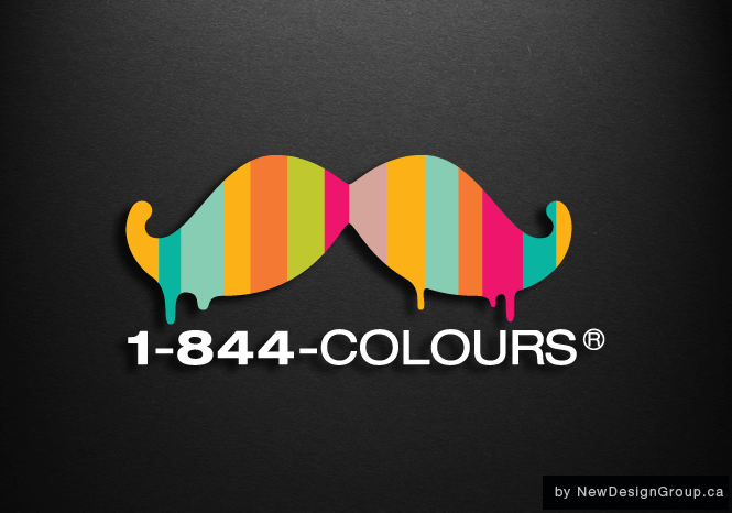
The logo is a pictorial mark that is immediately recognizable as a moustache – but has been painted in the colours of the rainbow, and there are a few drips of paint falling from it: a simple, stylized image that no one can misinterpret.
2. Website
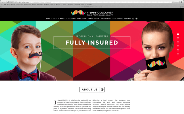
This website design is intriguing from the moment the visitor arrives. The banner photos are exceptionally good quality with bright colours apparent throughout. And check out the moustache – it has been unleashed! It puts in an appearance on a card held in front of a girl’s mouth and as a black Hercule Poirot affair on a stick held in front of a boy’s face. There is a further banner photo showing a cat with the cheeky moustache, and one photo shows a man with his own luxurious moustache rather than the stylised version.
Whilst the frequent sightings of the moustache within the website are bound to amuse the visitor, the overall professional design will simply impress. The content concisely explains why 1-844-Colours is the preferred choice when painting services are required, and the font is easy to read and modern. In addition there are two navigation options to cater for all preferences: visitors who like to move around a website traditionally will appreciate the top navigation bar; those who like infinite scrolling, such as seen with Pinterest, are catered for with the scroll down option on this website.
3. Staff uniforms
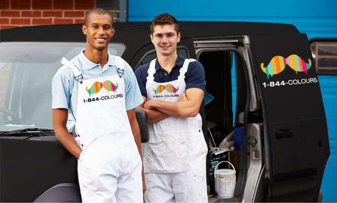
The simple uniform shows the moustache logo on a pristine white apron. One of the key selling points of the company is that the staff clean up thoroughly after each day’s work. This uniform implies that staff keep themselves clean and so know how to keep their working environment clean.
4. Business Cards
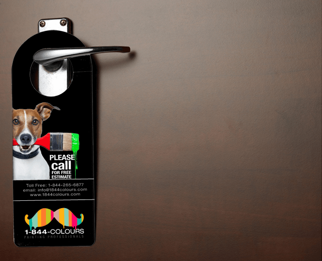
A business card that draws attention to itself is unlikely to find itself carelessly tossed into a drawer without a second thought – it will encourage the holder to make that call. The business card design for 1-844-Colours is simplistic but bold. The colourful moustache is well placed so that it is highly visible but doesn’t overwhelm the contact details and company information.
5. Vehicle Graphics
Following on from the business card design, the company vehicles are jet black with the moustache and company name standing out proudly. Driving around town between jobs, these vehicles have the ability to intrigue the viewer and stay in the mind.
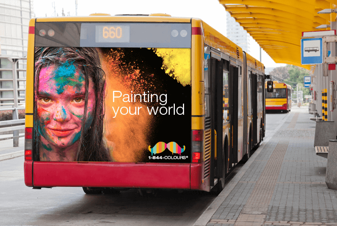
The graphic design for the bus is particularly eye-catching: the image of the paint covered girl certainly demands attention and the tagline “Painting Your World” clearly indicates that the company is in the painting business.
6. Lawn Signs
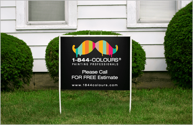
Companies who work out and about should never underestimate the importance of the humble lawn sign: whoever walks or drive by is bound to see it, particularly if it really stands out. The lawn signs for 1-844-Colours do just that by having the cheeky moustache placed on a black background. Not only are the company name and website highly visible, but the lawn sign encourages viewers to call up to get their own free quote.
In addition to these elements, New Design Group also provided designs for company stationery and brochures all emblazoned with the cheeky moustache logo, to help spread the word about this new start up.
Where Now?
1-844-Colours is the kind of company to keep a beady eye on. When a start-up is willing to take on its competitors with such an innovative and unusual brand identity, it has the potential to be a force to be reckoned with. Very few companies would have chosen the Moustache Concept: they would have erred on the side of caution and chosen the pastel palette or primary colour palette.
But 1-844-Colours sees a real need for professional painting services in the Ontario area and has the ambition and drive to succeed, and expand further to construction industry, include building houses and home renovations.
And they are sure to be working with New Design Group again in the future. Client commented: “After our initial meeting with New Design Group, they submitted multiple branding and website design concepts which were all very excellent. With input from New Design group we decided on a logo and the website design followed that. The whole experience has been excellent.”