Introduction
Napier Outdoors, a leader in vehicle camping tents, sought to modernize their brand without losing the legacy of their well-established identity. Our agency, NewDesignGroup.ca, was tasked with evolving their logo to resonate with contemporary audiences while maintaining the essence of their original brand.
Background
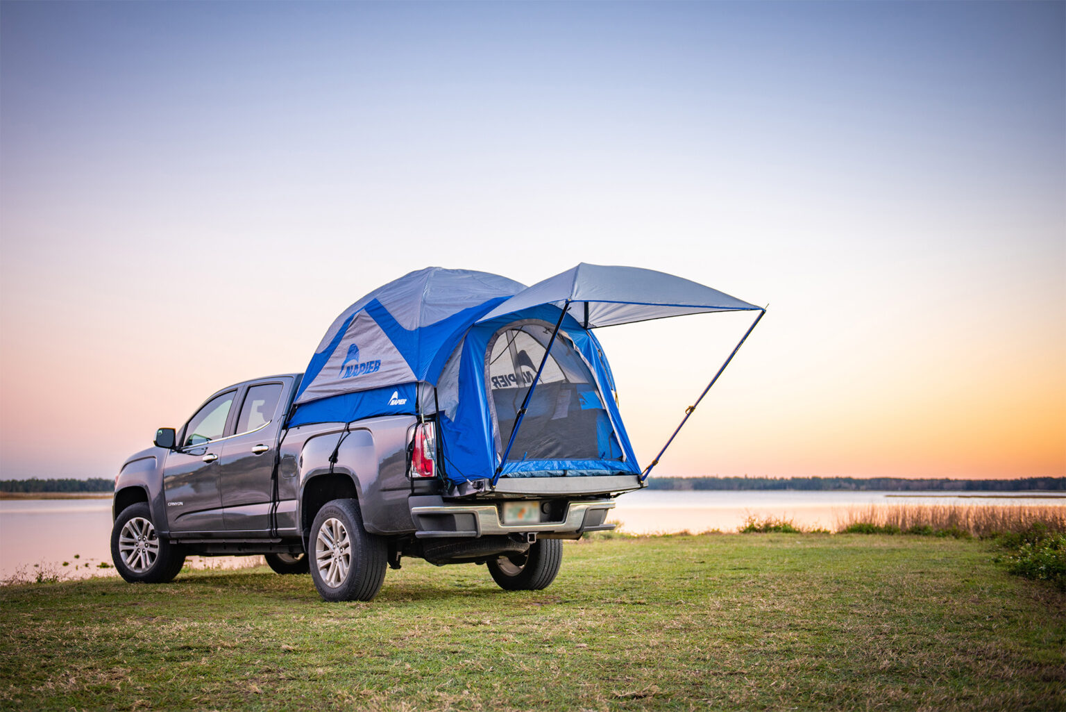
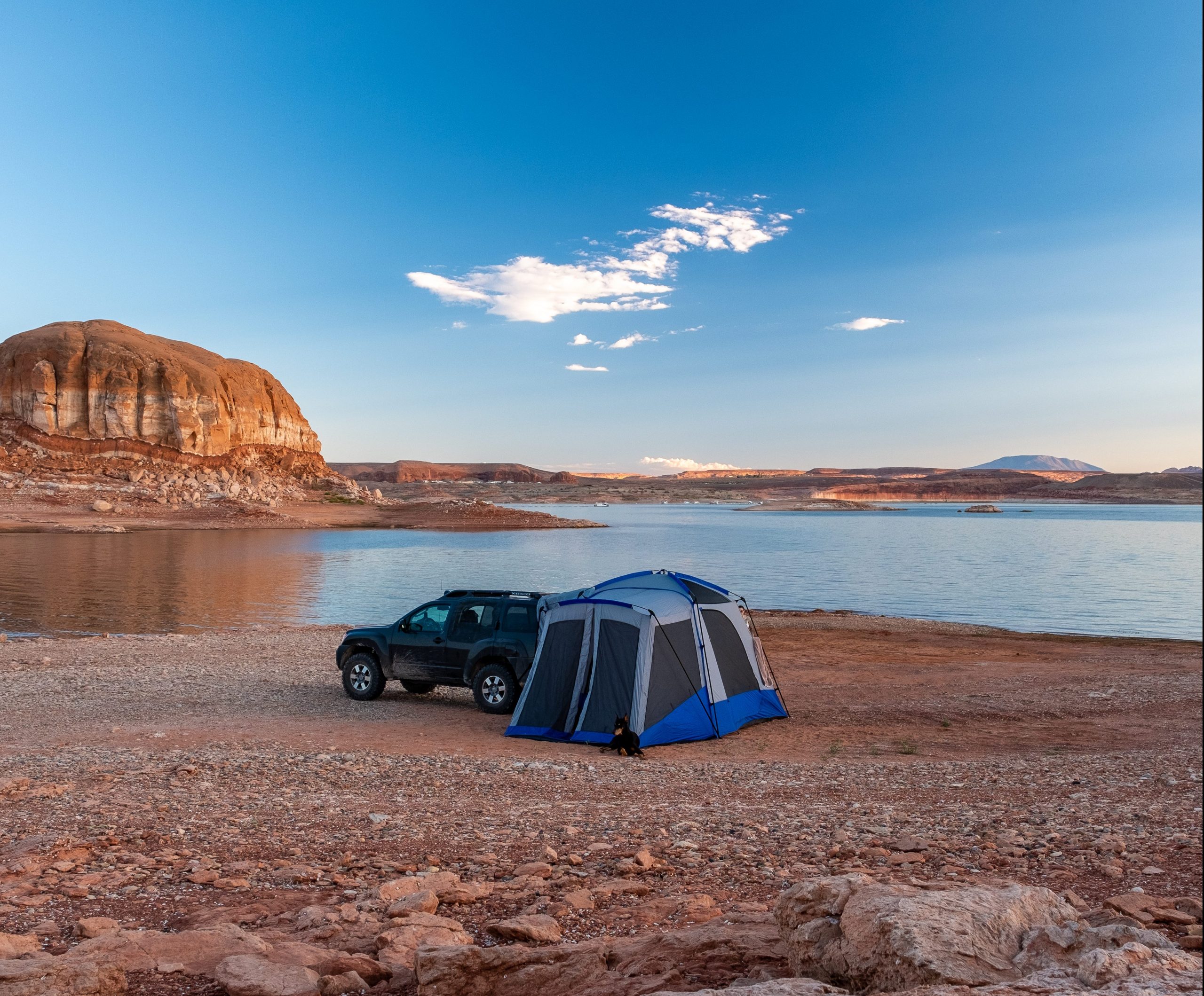
Founded in 1990, Napier Outdoors has grown from a niche developer of three tent models to the world’s premier vehicle camping tent distributor. Their innovative merging of the automotive and camping industries has reshaped the camping experience, and their branding needed to reflect this unique market position.
Challenge
Our challenge was to create a logo that retained elements of the original design, ensuring brand recognition and loyalty among existing customers while appealing to new demographics and standing out in a competitive market.
Process
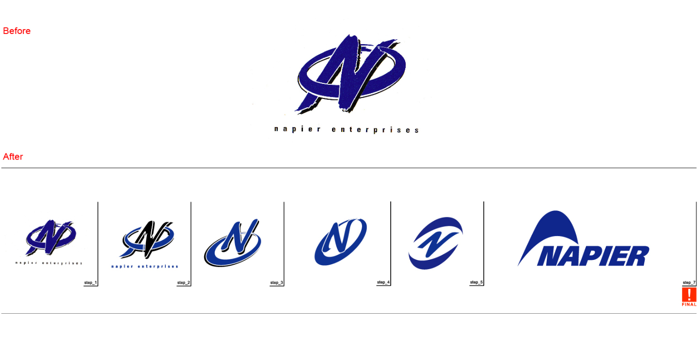
We began with a thorough analysis of Napier Outdoors’ history, values, and market positioning. The original logo, featuring intertwined initials in a complex blue design, represented the company’s commitment to quality and innovation. Our approach was to simplify and modernize this concept.
Design Evolution
- Step 1: We deconstructed the original logo to understand its core elements.
- Step 2: Initial concepts were developed to simplify the intertwined initials.
- Step 3: We experimented with different forms, focusing on readability and versatility.
- Step 4: A streamlined version of the letter ‘N’ was stylized to suggest a tent’s shape subtly.
- Step 5: We refined the typography and color palette, opting for a crisp, modern font and a refreshed blue to signify trust and reliability.
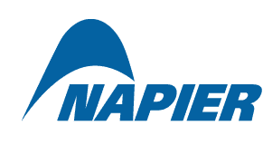
- Final Step: The end result was a sleek, abstract tent shape that maintained the ‘N’ of Napier, encapsulating the company’s heritage and its future direction.
Solution
The new logo captures the essence of Napier Outdoors — innovative, reliable, and connected to nature. It is scalable across various media, from product packaging to digital platforms, and reflects a modern, dynamic company at the forefront of the vehicle camping industry.
Results
Post-launch, the rebranded logo has been well-received by customers and stakeholders. The new design has improved brand recognition and has been instrumental in marketing campaigns, driving increased engagement and sales.
Conclusion
The rebranding of Napier Outdoors’ logo stands as a testament to the power of strategic design in aligning a company’s visual identity with its evolving mission and market. Our work with Napier Outdoors highlights how a thoughtful design process can pay homage to a brand’s legacy while propelling it into a new era.
