

Astonish Inc.
Astonish
Retail
Logo Design
Packaging Design
Promo Materials
The Challenge: We did not look at this project as a challenge, it was quite the opposite. Our dealings with the Astonish brand were pleasant and exciting as there are no other stores like this located in Yorkdale Mall in Toronto, Ontario. New Design Group Inc. looks to make this brand a success and deliver a triumphant brand identity design. So how did we develop a timeless store front brand that will eventually be seen across North America and that we are sure will have great franchise potential and be in line with mega brands like Sephora and Lu Lu Lemon?
The Astonish Branding Case Study – The High Profile Case
When the company Astonish, which specializes in African hair care products, wanted to brand their products and flagship store, they were smart enough to hire a professional brand development company. The owner was well aware that the beauty industry is highly competitive with a number of best selling ethnic hair products already on the market, and that the only way to been seen amongst the masses was to have a strong, effective and memorable brand.
When the Astonish team met with New Design Group they were able to discuss their vision for the company and to detail their target market – men and women with African hair who want to restore it to its natural beauty. African hair is stunning in its natural state but is very delicate and prone to breakage – sun, stress and the over enthusiastic use of hair dryers and flat irons can cause serious damage. The unique selling points of the Astonish products are that they are based on treatments handed down through generations and are formulated to reverse damage and to preserve the natural condition of natural hair.
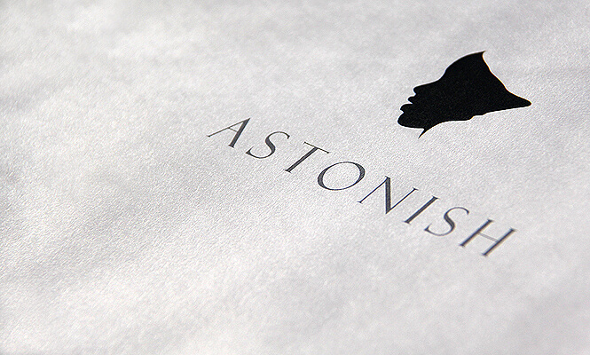
2.1 Logo: As with all good branding projects, the creative team firstly focused on the logo which would appear on all products, packaging and in all marketing material such as the website, storefront and publicity posters.
The characteristics of a good and successful logo can be summarized as:
The New Design Group creative experts designed several drafts which were firstly tested on focus groups and then presented to the client. After review, a unanimous choice was made – a logo depicting the side profile of the company owner’s face.
This logo is indeed astonishing and destined to be high profile. It is simple, distinctive and the characteristic profile clearly shows that the company has African origins. This is a smart logo which will never go out of fashion. Furthermore it is beautifully designed and easily scalable – it will be just as impressive on a business card as on a store front. And most importantly, the clients loved it.
With the logo finalized, New Design Group was able to create further branded materials:
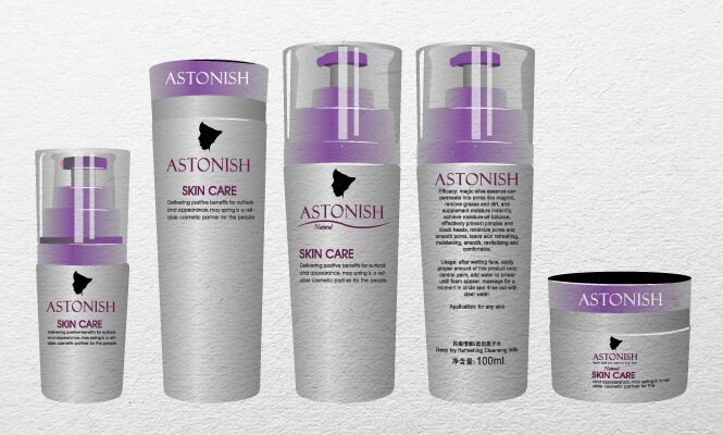
2.2 Product packaging: The logo features prominently on the packaging, and the use of silver with purple gives a sophisticated look. Coupled with the use of ‘Astonish’, this packaging demands attention and it’s a safe bet that clients browsing in the store would be tempted to pick up a product and read more to find out what it can offer them.
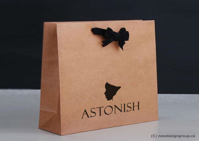
2.3 Shopping bag: Clients who purchase a product in store expect it to be popped into a store bag. Not only is this handy for the purchaser, but when the bag is carried down the street, other people will see it – and the more brand impressions made, the more people will start to recognize and remember the brand. This shopping bag continues the theme of simplicity with the profile logo boldly displayed for everyone to read. The final touch of the black ribbon gives a sense of luxury to the bag.
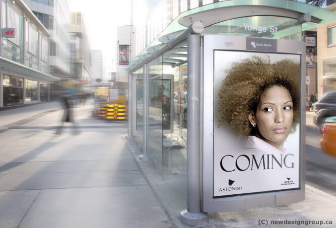
2.4 Bus stop poster: When planning the launch of a new product, bus stop posters are a great way to build awareness. This poster is certainly attention-grabbing. The model, with wonderful, natural African curls, draws the eye, and the simple use of the word ‘Coming’ imparts a sense of expectation in the viewer – they will want to know what is coming, and when. The logo is placed subtly at the bottom but clearly show the profile image and company name.
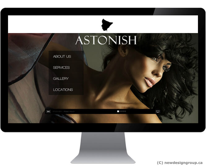
2.5 Website homepage: Maintaining a sophisticated look, the website homepage design uses a restricted palette of colour: the black profile logo jumps out from the white header and the use of white font for ‘Astonish’ on a dark background makes it clear from the start whose website this is. A beautiful black model with beautiful hair indicates that this website is all about enhancing beauty.
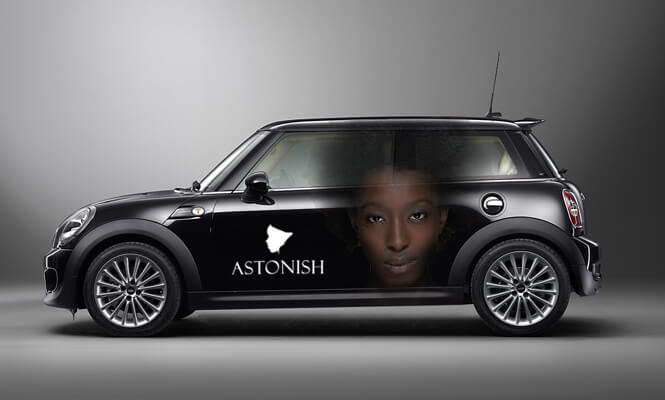
2.6 Car livery: Similar to shopping bags, branded cars have the potential to make a whole lot of brand impressions. As they zip around town, these vehicles are likely to be seen by hundreds of people every day and will increase brand awareness in the locality. The design for Astonish shows the reverse logo – a white image on a black background and still highly effective. The image of a striking African woman artfully placed across the car doors and windows emphasizes the niche target market of this company. When a vehicle sports a stunningly unique and traffic stopping design such as this, there is no doubt that passers-by will stop, stare and remember the brand name.
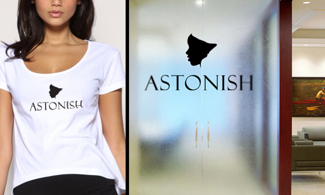
2.7 Office: Every professional company needs to brand their premises and staff. Often simplicity equals elegance. By using just the logo on the office door and on crisp, white staffs T-shirts, both are effectively and memorably recognizable as part of the Astonish brand identity.
For New Design Group, the Astonish Branding project was exciting from beginning to end. Working with an enthusiastic client who wanted to launch a new type of store in the locality was inspirational. The delivery of a triumphant brand identity design based around a smart and simple logo of the owner’s profile thrilled the client – and this brand truly has the potential to become seriously high profile in the beauty business.