

Murrenhil Corporation
ROC Barrier
Manufacturing
Verbal branding
Corporate Identity Development and Logo Design
Photography
Presentation Folder Design
Product Identity Design
Website Development and Maintenance
I was impressed with the samples provided on their site for brochure covers, logos, and websites, and when reading about the company and the services they provided, I decided they had everything we were looking for. To our surprise the New Design Group had everything, and more than we were looking for! I think they saw our vision a little more clearly than even we did! Our brochures, logos, and website went above and beyond our expectations. To this day, we still receive compliments on our website. Dmitri and his team heard our concept loud and clear and translated it into our logos, brochure and website. Dmitri and his team were always professional, friendly, and actually made us feel like we were their most important clients.
The team was always available to answer any questions or concerns we had, no matter the time, day or evening. At all times every effort was made to ensure we were happy and satisfied with every aspect of the project as it moved along. I can honestly say we were ecstatic when the project was completed, and our vision had come to life right in front of our eyes. It was an absolute pleasure to work with Dmitri and his team, and we highly recommend the New Design Group.
Sincerely,
Glenn Murray
President
Murrenhil Corporation
Where would we be without water? Many people in the western world take clean running water for granted but it is a precious commodity. Unfortunately oil spills off the coast and in fresh water are a daily occurrence, ranging from small spillages from individual boats in distress to headline-making disasters. Oil spills have the potential to contaminate the water supply, kill marine life and birds, deteriorate our health, and alter the ecosystem of coastal wetlands irreversibly.
Fortunately there are companies who care passionately about the environment such as the Murrenhil Corporation who are true green champions. They are an eco-friendly company which was established in 2008 and developed the world’s fastest first response oil containment system: ROC (Rapid Oil Containment). This film laminate system can simply and effectively contain an oil spill before it spreads and carries out its devastating damage, helping to keep the planet’s waters free from pollution. But more innovatively it is held in a small canister, no more than 20 inches in length making it the only oil containment system small enough to be stocked in all water-front locations – it requires 1/20th of the storage space taken up by similar materials on the market.
The Branding Objective
Having developed such a great product it’s no surprise that the Murrenhil Corporation wanted every marina in the Americas to be equipped with it – because quick action to clean up an oil spill is imperative to minimize environmental damage.
To make its voice heard in the big, wild, ocean-faring world, Murrenhil Corporation wanted a very strong brand – a professional and eye-catching identity which would reflect the fact that they were at the forefront of green initiatives regarding prevention of water pollution.
The Brand Development Company Choice
The Murrenhil Corporation approached New Design Group in Toronto after being impressed with the portfolio displayed on their website. The two companies immediately saw eye-to-eye: Murrenhil Corporation admired the creativity and professionalism of the New Design Group team; New Design Group loved the philosophy and enthusiasm of these green champions and admired their strong environmentally focused beliefs.
The Branding Requirements
The brief was to redesign a range of marketing materials as part of a new sustainable brand identity. New Design Group worked closely with Murrenhil Corporation to fully understand the products, target market and objectives of the company. The aim was to create a brand that was memorable and would evoke a strong emotional response in people who saw it, and to reflect the ecologically sound principles the company is based on.
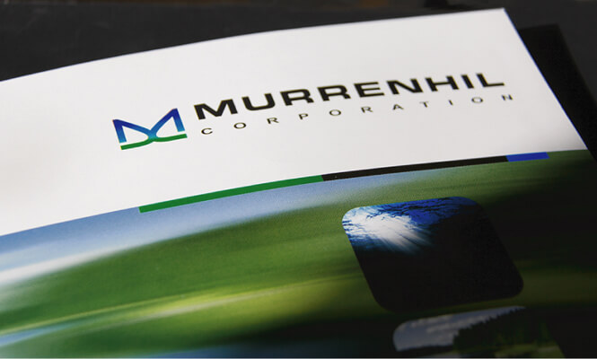
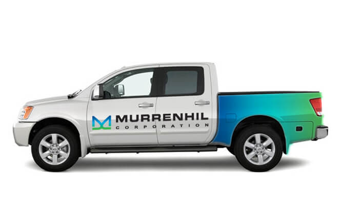
Two different company logo designs were created. The logo preferred by the client shows a large ‘M’ in calming marine blues and greens, with a gentle green line below, reminiscent of calm waves on the ocean. By using curved lines and graduated colors the logo reflects the gentle lines and colors found in nature. The overall look is classic, memorable and professional.
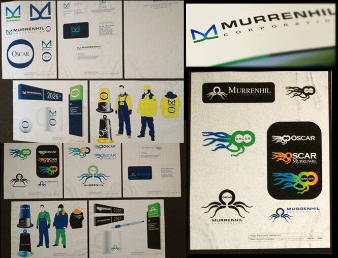
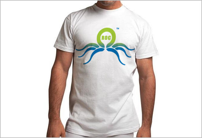
A range of concepts were designed. To unify the product logo with the company logo, Murrenhil Corporation chose the product logo designed with the same marine blues and greens. On first viewing, the design suggests an octopus, which is apt as these living creatures will be protected by the ROC system. Viewed differently the circular part of the logo represents the ROC barrier system, with the curves representing waves on the sea
Whichever way it is viewed, this logo is very different and extremely hard to forget – a perfect result!
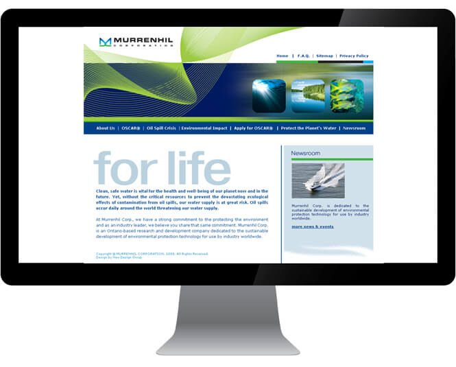
The header on the website demands plenty of attention. The company logo and block of dark blue give the website a corporate, professional feel. However the dark blue subtly morphs into an image of a lake’s surface and with the placement of three simple environmental photos in the same blue and green color scheme, the overall image quickly indicates that Murrenhil Corporation is all about water and aquatic wildlife. Pulling it all together are the modern swirling green lines giving the website a contemporary and an energetic feel.
The website layout is easy to navigate and gives full details of the products and how they work. It gives interesting facts and figures about the reality of oil spills across the world both in environmental and economic terms. The content is perfectly pitched to explain Murrenhil Corporation’s objectives and products.
New Design Group helped Murrenhil Corporation to produce an excellent video for display on their website and on YouTube by providing key photography to complement the film. The resultant video features prominently on the website because it clearly shows how the ROC system is used and how effective it is – images can be clearer than words and this professional looking video is simplicity personified.
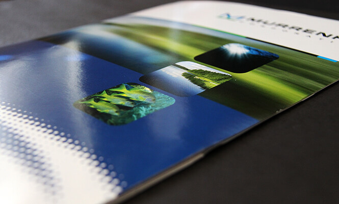
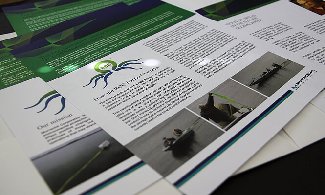
Murrenhil Corporation decided to have a presentation folder because of the flexibility it offers. The main brochure showcases the key elements about the company and products that don’t frequently change – and the inserts displaying elements likely to change perfectly within the folder. For a cost effective update, the inserts alone can be reprinted cost effectively.
Any company that is serious about promoting their products and making a mark for themselves in their industry niche will be present at appropriate tradeshows. New Design Group created tradeshow banners designed to reflect the corporate and product brands of Murrenhil Corporation. A number of promotional product designs were also created for giveaways at tradeshows: pens and mugs with the company name and the great octopus logo clearly shown.
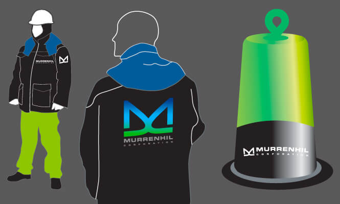
Staff uniforms are often overlooked by companies but they are an important part of any branding strategy. The designs of these functional uniforms are simple – showing the company name and product logo clearly. When staff is out and about in these uniforms, they will gain attention and increase brand awareness.
Presentation to Client
The best way to present the final designs to a client is by the use of storyboards. This enables the client to see all of the brand design options together, to assess how the logo fits in with the other designs and how the brand identity is consistent across all items.
When Murrenhil Corporation saw their storyboards, it’s fair to say that the green champions were blown away with the results. And New Design Group was thrilled that their work was so well received as it had been an enjoyable and inspiring project to work on.
Client testimonial
Here’s what Glenn Murray, President of Murrenhil Corporation had to say about New Design Group branding project:
“New Design Group had everything we were looking for. I think they saw our vision a little more clearly than even we did! They heard our concept loud and clear and translated it into our logo, brochures and website. Our brochures, logos and website went above and beyond our expectations. To this day we still receive compliments on our website.”
And New Design Group wishes these green champions all the success they deserve in the future – after all the wellbeing of the planet is dependent on far sighted companies such as these.