

PowerOn Control Systems Inc.
PowerOn Control Systems
Manufacturing and Engineering
Brand Identity Design
Logo Design
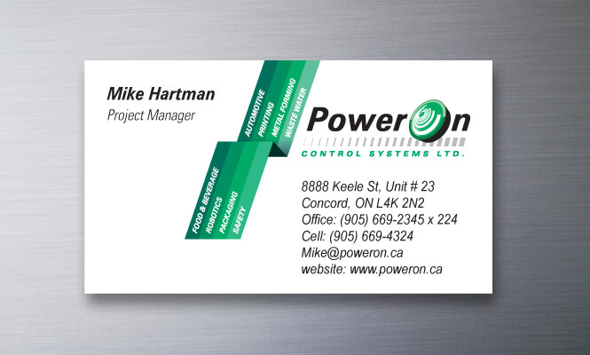
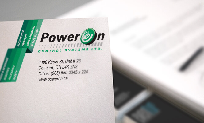
Promotional Materials Design
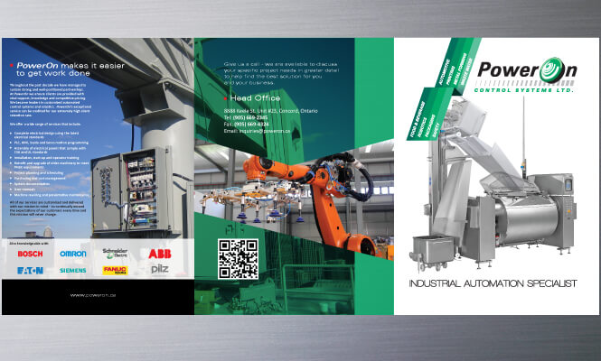
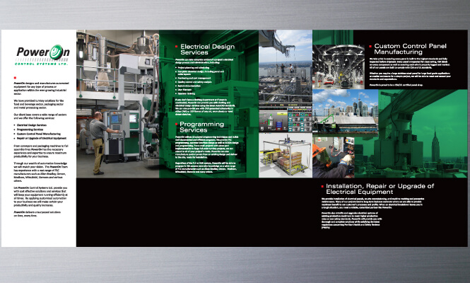
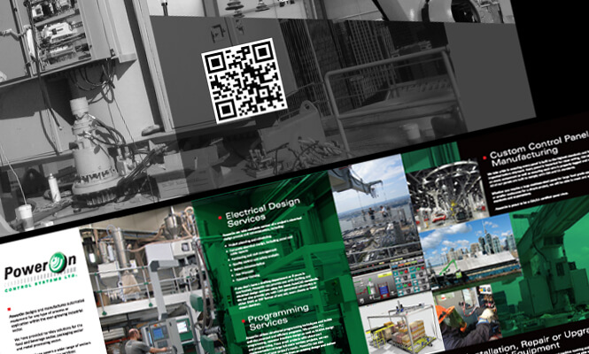
Presentation Folder and Inserts
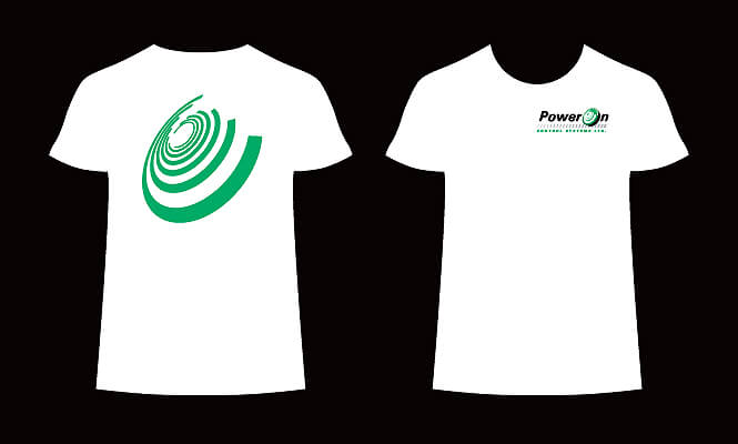
Employee Uniform
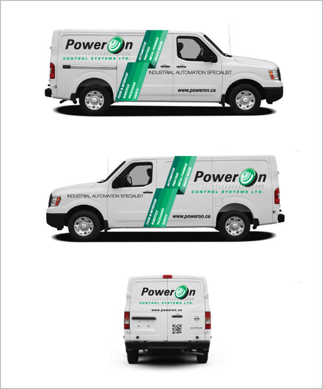
Truck Graphics
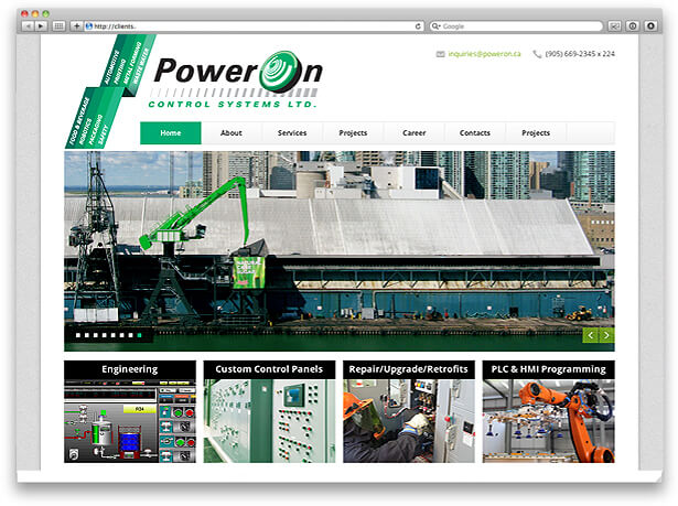
Website Design
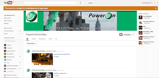
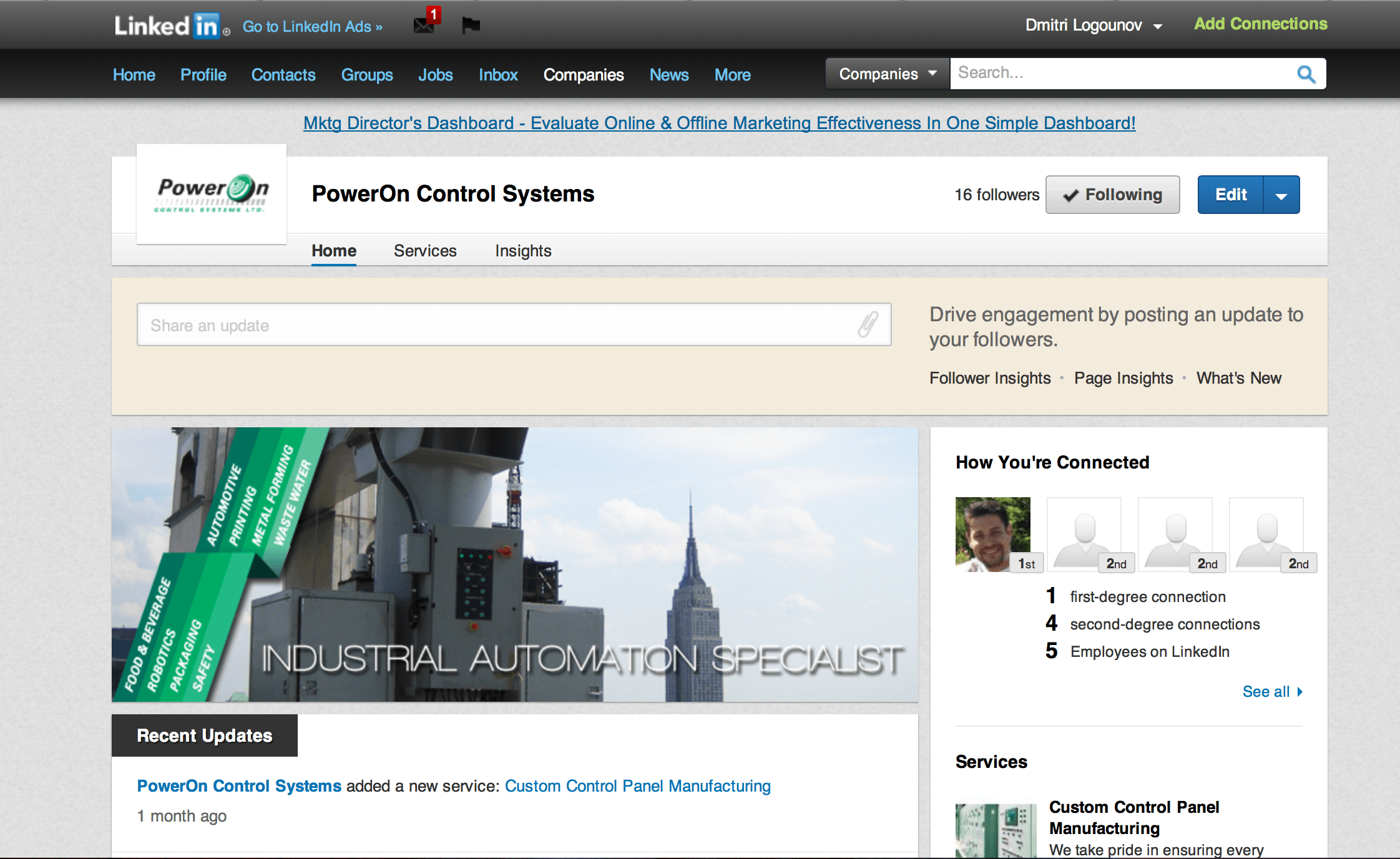
Social Media Corporate Pages
PowerOn is a successful industrial automation company offering solutions for a wide variety of sectors such as pharmaceutical, food manufacturers and water treatment plants. The company provides electrical engineering, programming and custom control panels amongst other automation specialties. It has been operating for more than a decade and is based in Concord, Ontario. It boasts many repeat clients who want to use PowerOn’s brilliant engineering skills time and time again.
But it’s also a company with a big vision and knows precisely where it wants to be in the market – and that’s up there with its biggest competitors in Canada, the US and beyond. When PowerOn was unsatisfied with their outdated website they approached New Design Group with a proposal for a straightforward website redesign project. But the final project encompassed far more – this was the case of unexpected redesign requirements.
1) The Initial Brief
The company had a clear vision of their new website: it needed a modern design, had to be user-friendly, visually exciting, highly persuasive to attract new clients, and perfectly search engine optimized (SEO). Their existing website had no SEO and they were well aware that they were missing out on potential customers getting snared by their competitors with better ranking websites.
Another irritation with their existing website was that they were unable to make updates directly as the website had no Content Management System (CMS).
2) Data Gathering
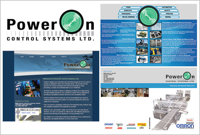
An important step for any brand development company such as New Design Group is to fully understand the client, the products, the target market and in the case of an established company, the existing marketing portfolio. New Design Group quickly realized that PowerOn’s existing branding materials showed little consistency – the website, brochure and PowerPoint presentation all had a different feel. In addition there were other areas that PowerOn was simply not harnessing in their marketing efforts: for example, staff and company vehicle branding was non-existent.
3) The Emergence of the Unexpected Redesign Requirements
PowerOn is a well established company that is growing fast and is trying to break into the US and European markets. They fully appreciated the need for a strong, professional and consistent brand and were very receptive to New Design Group’s branding update recommendations – soon the original brief was expanded to include a redesign of all branded materials, plus the creation of some new elements.
4) Key Challenges
Unsurprisingly PowerOn wanted to move quickly on this project. The key challenges for New Design Group were:
5) The Redesign Project
One of the key objectives was to create a professional and credible brand in line with that of PowerOn’s partners: Omron, Rexroth Bosch Group and 360 Guarding, and to have a brand more superior than those of its nearest competitors. The brand needed to personify PowerOn as a big player in a competitive industrial automation industry and to do justice to the excellence of the engineering skills on offer.
From the very first viewing, PowerOn’s modified brand needed to convey professionalism, expertise and to clearly explain the capabilities of the company. Any potential customer who saw the website, business card, brochure or staff would immediately appreciate that this was a company that could deliver what they promised to the highest standards, efficiently and effectively. This brand could not afford to depict the company as a small outfit with limited experience – PowerOn wanted customers to immediately know that they were the company to deliver top of the range industrial automation for all types of industry.
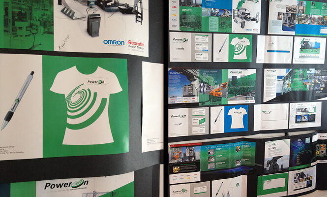
A number of branded elements were redesigned to give them a more contemporary look while retaining the company’s existing recognizable visual identity. As is the norm for this kind of project, slightly different designs were created for the following elements to provide the client with several choices:
Website.
6) Social Media Presence
During the project, NDG discovered that the company had existing videos of completed projects which would lend themselves ideally to a YouTube company page. New Design Group set up PowerOn on YouTube and also on LinkedIn –both important social media websites to take advantage of when promoting a business.
7) Presentation to the Client
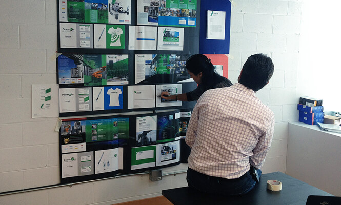
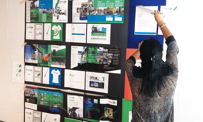
To make the presentation to the client, three different concepts were displayed showing the logo and design options across all branding tools. By displaying them clearly side by side it was easy for the client to see how the redesigned brand would work in practice.
PowerOn could easily see how the branding was consistent across all materials, how the overall look was highly professional, appropriate to the industry and certain to be highly memorable. The website redesign and powerful, persuasive text would make it easy for any visitor to quickly understand the company’s offerings. With a newly established social media presence, customers could also choose to learn more about the company on their preferred social media website.
8) Client Feedback
PowerOn was absolutely delighted with all of the newly designed branding tools and were able to choose their preferred concept for immediate implementation.
New Design Group was similarly delighted to have met, if not exceeded, the client’s expectations. By using their vast experience in the area of brand design, a company walked away with a great new updated brand. And even if the original brief was just for a website redesign and then quickly expanded to include all branded materials, a good brand development company is always ready for the challenge of the unexpected.