

ToroFx
ToroFx
Financial
Verbal branding
Corporate identity development
Social media accounts development
Website design
The Challenge: In a city like Toronto, competition in the financial services industry is fierce and unforgiving, especially for an unknown company. Our biggest challenge was to create the aura of a mature and stable company that could be trusted and relied upon. It was of the utmost importance to design a corporate identity that could be encompassed in all promotional materials and ensure their clients felt a trusting and reliable atmosphere at all times whenever they saw the ToroFx logo design.
The Solution: Within four years ToroFx was bought by the industry leader, Equity Financial Holdings Inc., for a whopping $5,000,000 – impressive!! We stuck with the ToroFx theme, reliable, trustworthy, stable, and capable, throughout the entire marketing campaign. The theme was seen throughout their stationary design, logo design, presentation folders, and website. We developed campaigns which resulted in a larger market share in the foreign currency trading market in Canada.
Branding Case Study of ToroFx: The Bullish Case
ToroFx, a foreign exchange service for businesses and individuals, was founded in 2006 in Toronto. From the beginning the founders had a clear and remarkably ambitious plan to succeed in the competitive Bay Street financial sector. The financial services industry is notoriously difficult to break into but ToroFx was not to be dissuaded. They were adamant that they could break into this tough market and attract established clients.
To do so, they were seeking a powerful brand identity to catapult them into the market place. They wanted their brand to portray the start-up company as professional, experienced and well established; they wanted to be seen as respectable and trustworthy; they wanted not only their target market to sit up and take notice of them, but also their competitors – who needed to know that ToroFx was a force to be reckoned with and in for the long haul.
Choosing the Brand Development Company
ToroFx was discerning when choosing which company would design their all important brand. New Design Group was considered initially because of their extensive experience working with financial companies, in addition to their impressive branding portfolio.
On meeting face-to-face, ToroFx and New Design Group gelled perfectly – ToroFx loved the ideas and vision of the New Design Group team, and trusted their expertise. And so the brand development company was chosen.
The Branding Objectives
The company required a complete brand identity including a logo, stationery, corporate presentation folder, business card and website.
The Inspiration
ToroFx is an inspired name for a company in the financial industry. ‘Toro’ is the Spanish word for bull and a bull represents stability, strength and stamina – all admirable attributes for a company which intended to crack the market and go from strength to strength. In addition, in economic terminology, ‘bullish’ means that prospects are on the up.
Consequently New Design Group focused on the bull as inspiration for the brand identity.
The Challenges
ToroFx wanted to move quickly and so set a one month deadline for New Design Group to create their new brand identity. In addition, the website offered up some of its own challenges – it needed to allow the plugin of a third party trading software.
The Branding Project
Logo: An emblem logo was created which combined the company name with a pictorial element – that of a symbolic side-profile of a bull’s head. The horn is large and suggests power but appropriately there is nothing menacing in this bull. The calm blue used for the bull’s head and the ‘FX’ gives a sense of corporate stability; the simple use of black for ‘Toro’ allows this part of the company name to jump out of the design.
The logo was then used to create a professionally designed business card and corporate stationery that maintained the overall look of this strong brand.
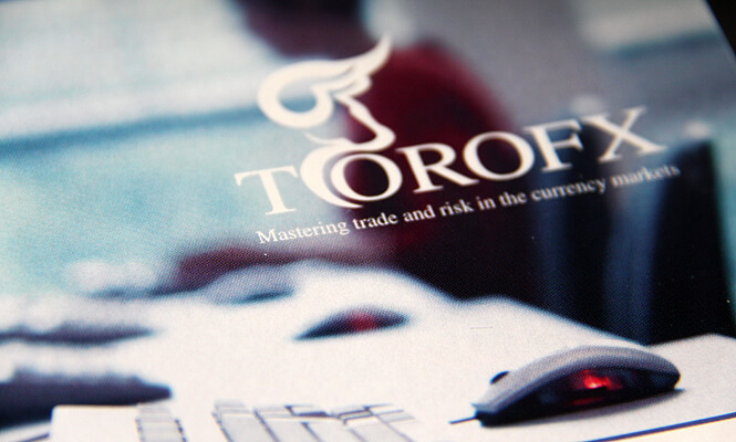
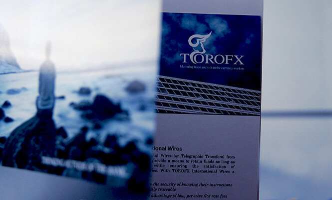
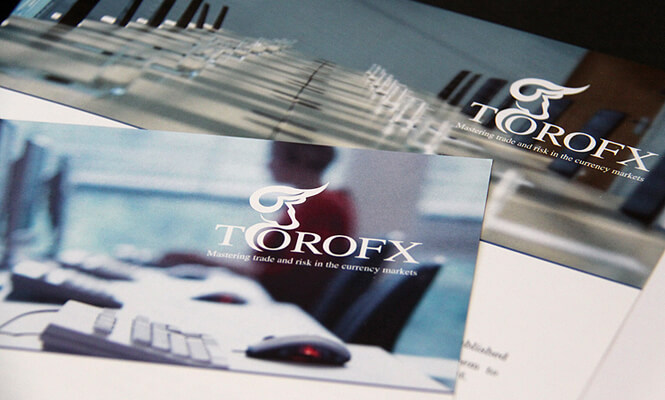
Presentation Folder: ToroFx required a branded presentation folder which was designed to be timeless – without containing specific information that could date. The different designs created show the strong logo in white on a photographic background depicting a corporate environment: a conference table, an office with computers. The inserts were also designed to maintain brand harmony and to use the logo to best effect – here shown in white on a dark blue background.
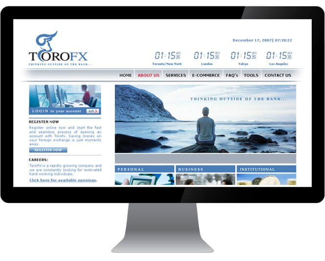
Website: The website design keeps the light blue, white and black colours. It appears calm, professional and the main photo of a man looking out to sea with the statement ‘Thinking Outside of the Bank’ is enticing, persuasive and is likely to make the website visitor sit up and take notice – it suggests that ToroFx has a caring side and will take good care of its clients.
Presentation to the Client
When New Design Group had completed their design options, they presented four storyboards to the client. These allowed the client to view all the different options and see how the brand identity came through on each piece of customer-facing material, and how the different designs would work in reality.
Client Feedback
Feedback was very positive: ToroFx knew they had found a brand identity to launch them into the financial sector as a strong player.
And they were right. After their launch, ToroFx made their mark and the financial industry took notice. Their brand identity defined the company as reliable, stable, efficient and trustworthy. And within four years, the company was bought by industry leader, Equity Financial Holdings Inc. for an amazing $5,000,000! And in ToroFx’s eyes, New Design Group was better than good – they were a good luck charm!