

WeFixSreenz Inc.
WeFixSreenz
Professional services
Logo Design
Website Design
Employee Uniform
Truck Graphics
Promo Materials
Social Media
WeFixScreenz offers a mobile screen repair and replacement service. As a start-up run by an energetic team, offering quality products, an on-site service and exceptional customer service, WeFixScreenz wanted to get these key messages across to potential customers. By hiring New Design Group to create a strong company brand identity, they wanted to secure their share of the of the residential and commercial window screen market.
The Challenge
WeFixsScreenz needed a complete set of branded materials to attract new clients and one which would show why the services they offered were superior to those of their nearest competitors:
The Solution
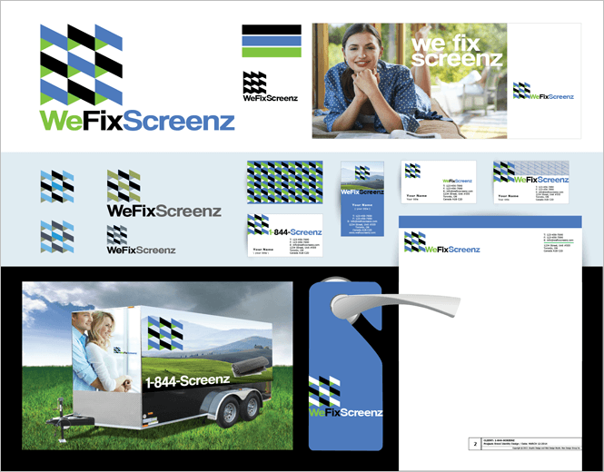
A dynamic company requires a bold logo. The WeFixScreenz logo comprises strong blues, greens and blacks in a geometric design reminiscent of open awning windows. Its clean and simple design means it is a scalable logo – it will look as good on a business card as when it is reproduced on the side of a company van.
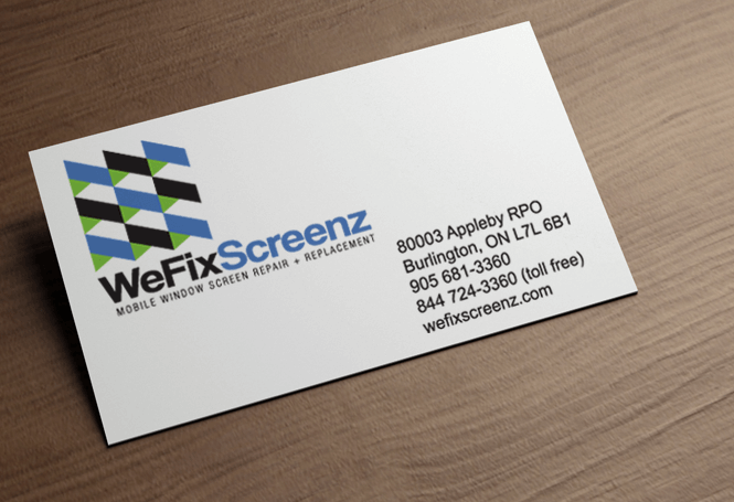
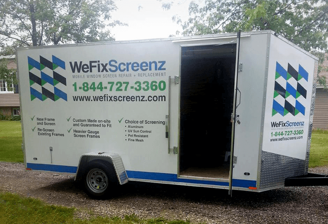
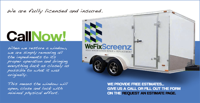
The business cards produced by New Design Group give prominence to the logo with the contact details simply and clearly displayed. The vehicle livery again focuses on the eye-catching logo with the contact phone number and website featuring prominently. The importance of branded vehicles is particularly important in a service industry where vehicles will be out and about and can create many brand impressions as they travel.
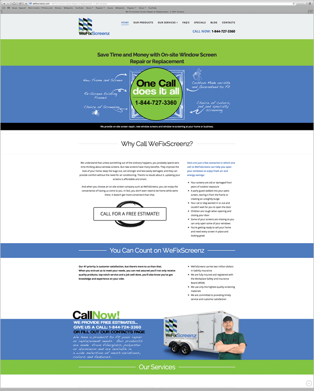
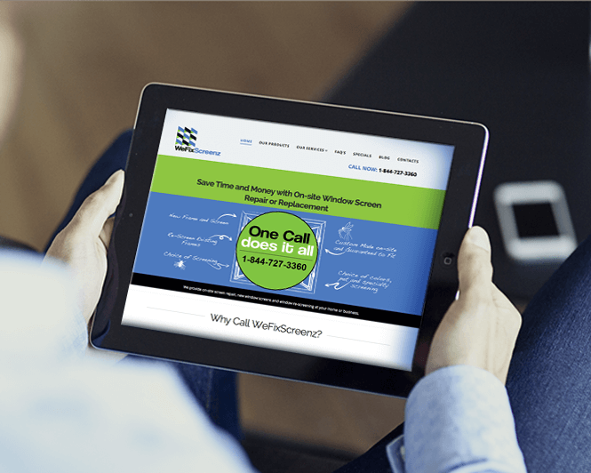
For a strong online presence, the website not only retains the same colour scheme and clean cut layout of the logo, but it is a key platform where the company’s unique selling points can be highlighted. This attractive and easy to navigate website explains the WeFixScreenz difference on every page.
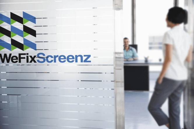
To complete the set of branded materials, corporate stationery and office signage were created around the same design: essential items to show customers they are dealing with a professional company whether they simply receive a quotation on headed paper or visit the offices in person.