

ABC Funds Inc.
ABC Funds
Financial
Website re-design
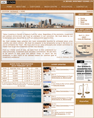
ABC Funds is one of the best known financial companies in Toronto. When the company decided to update their conservative website, they want a brand new look to exhibit their professionalism and energy. They needed a website more relevant to today’s modern audience and which would provide an engaging experience for the visitor.
They choose to work with New Design Group which was the only company they talked to with insight into the world of finance and with proactive ideas about how to reach out to ABC Funds’ audience. ABC Funds challenged New Design Group with a tough creative brief: to break new ground in financial web design.
New Design Group drew on their extensive expertise in branding, graphic design and creative website development to produce a website that surpassed ABC Funds’ expectations: the contemporary website design enables visitors to fully understand the company’s philosophy and modern investment style; the up-to-date functionality allows ABC Funds to make regular updates easily ensuing visitors are always accessing current information.
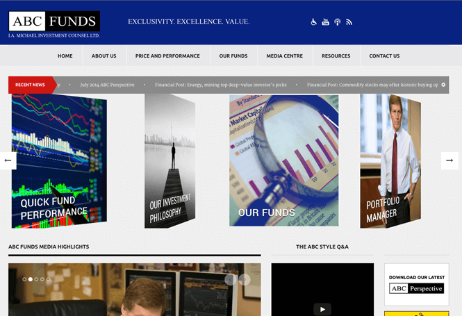
– Before –
2. ABC Funds Background
I.A. Michael Investment Counsel Ltd is a well-known financial company which has managed ABC Funds since 1988. Its President, Irwin A. Michael, Chartered Financial Analyst, is known for his money management acumen. He has served as a director of the Toronto Society of Financial Analysts, is a former vice president of the Toronto Futures Exchange and is a much sought-after guest speaker at financial gatherings.
3. The Challenge
Irwin A. Michael realized that the existing company website, which was originally created in-house, needed modernization to attract more interest in the company funds. It lacked the image and functionalities that the company wanted to offer to its website users.
“Our old website didn’t have the energy we wanted to exhibit to people,” he said.
The company needed a modern, user-friendly experience that would work beautifully across different devices and would be meaningful to customers.
Furthermore the website technology required an overhaul: the HTML website was cumbersome to update and a CMS (Content Management System) system was needed. It also needed to have a clearer navigation to sensibly order the enormous amount of information on the existing website and of course had to comply with AODA.
ABC Funds approached New Design Group, amongst others, with a challenging creative brief to update their stale website: not only did they want a contemporary and engaging website which would encourage visitors to return time and time again, but they wanted something fresh and new that would make their website stand out in the world of finance.
4. The Pitch
When New Design Group pitched for the contract, they didn’t just focus on the aesthetics of the website redesign. Led by Director and company founder, Dmitri Logounov, the team took time to research the core mechanics and drivers of the financial field, and to learn more about the target market of ABC Funds
ABC Funds soon appreciated that Dmitri fully understood the financial niche and the vision ABC Funds had for the website redesign and for functionalities it would offer the visitor. The website redesign proposal put forward by Dmitri’s team clinched the deal.
“When we met with New Design Group the lights went on,” said Irwin. “Another agency was very much recommended but we didn’t feel their vision was a good fit. We’re entrepreneurs: we wanted to work with another entrepreneur!”
In fact ABC Funds was so impressed with New Design Group’s vision and understanding of the project, that they set another challenge: to redesign their Value Investigator website. This site is where users can investigate financial data and share prices of companies bought by ABC Funds.
5. The Objectives
New Design Group went on to set objectives for the website redesigns which would benefit both the website visitor and ABC Funds:
5.1 Visual Objectives
5.2 Functionality Objectives
5.3 Back Office Objectives
5.4 Other Objectives
6. The Process
Once the objectives of the new website were agreed with ABC Funds, Dmitri and his team set about creating it. There are many behind-the-scenes activities that a web development companies need to undertake before a new website goes live:
Once the website has been created, there are key steps to be taken pre-launch, such as testing functionality and links. Only when the website has passed the necessary quality assurance tests can it be transferred to a live server.
At this point, a website analytics tool needs to be used to allow the company to assess the effectiveness of their website and to undertake market research. A good website analytics tool will monitor the number of visitors, country of origin of visitors, the popularity of different website pages, where visitors came from (organic searches or from referring sites for example) and far, far more.
During the development process, New Design Group liaised regularly with ABC Funds and provided a weekly update report.
7. The Solutions – ABC Funds website
7.1 Visual Solutions
7.1.1 Brand Readjustment
The most noticeable difference in branding is the change of colour scheme to a corporate and professional blue. Blue is well known to be associated with success, loyalty, calmness and power and so is the perfect choice for an investment fund company like ABC Funds.
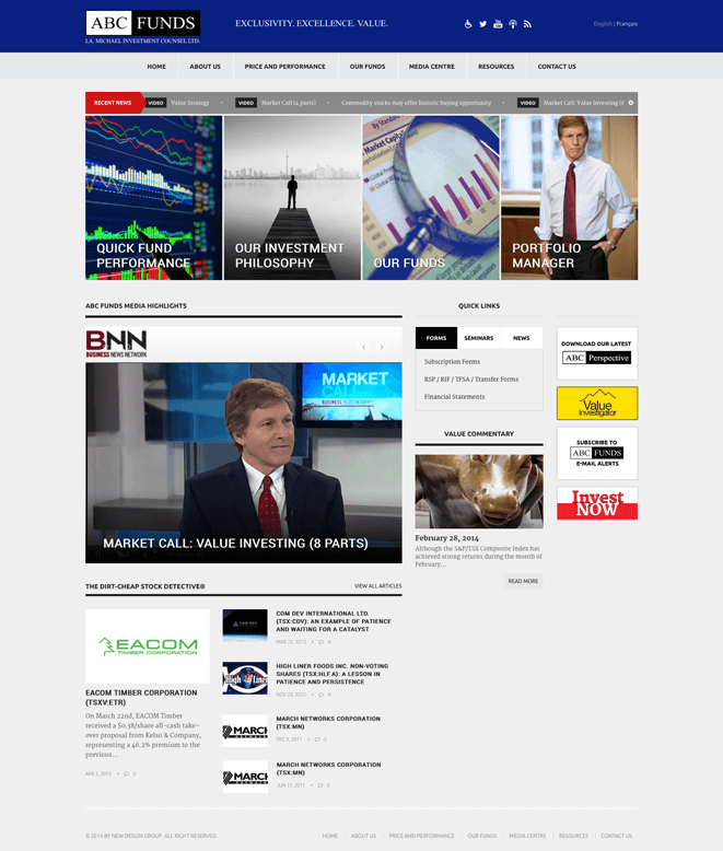
Bold images have been used on the homepage, in carefully chosen in blues and neutral colours, to give a high visual impact to the website. A sans serif typography was chosen for the main titles and on top of imagery which gives a clean, smart and authoritative look.
The tagline ‘INVEST YOUR MONEY WHERE WE INVEST OURS’, which has been placed in a highly visible location in the header, perfectly encapsulates what ABC Funds can offer its customers.
7.1.2 Modernisation of the Website
The new website offers intuitive navigation: the visitor can simply click on an image to get to the information they require. All content is concise and to the point – no superfluous text that could potentially bore the viewer. And with just one click everything is accessible from the homepage.
In today’s internet-overloaded society, this kind of approach is essential: people are busy and don’t have time to read reams of information. They have questions in their mind and want to find answers quickly. The ABC Funds website will appeal to even the busiest of people.
7.1.3 Highlight Unique Selling Points
It soon became apparent that Irwin A. Michael himself was the company’s USP: his intelligence and knowledge about the North American finance industry was impressive, and his strong values, which were instilled in the whole team, made this company stand out from its competitors.
Consequently New Design Group proposed to feature Irwin prominently throughout the website: he is featured as Portfolio Manager on the home page and below the fold, the ABC Funds Media Highlights section is accompanied by images of Irwin hard at work.
This innovative idea of combining corporate and personal branding was warmly accepted by ABC Funds and is an important feature of the new website – this personal touch helps potential visitors relate to the company.
7.1.4 Optimized website content
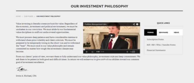
The website content was adjusted to be concise yet informative. Key messages from ABC Funds can be easily seen – for example by clicking on the image ‘Our Investment Philosophy’ on the homepage, the visitor is taken to a well laid out page with a personal message from Irwin. Importantly this message is written in a friendly and informal style – intended to not alienate the reader with highly technical terminology – and the video of Irwin further adds to the personal feeling.
7.1.5 Call To Action steps
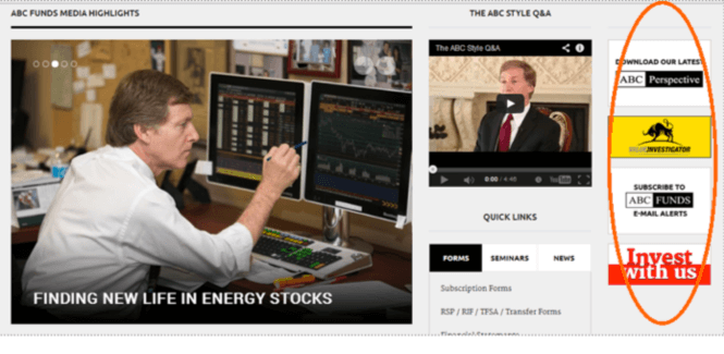
Ultimately the objective of any website is to get the visitor to take action. By using highly visible ‘Call to Action’ buttons on the right hand side of the homepage, the visitor is encouraged to click through to download information, sign up to email alerts or to start the ‘Invest with Us’ process.
7.2.1 Sign up for Email alerts
An important aspect of digital marketing is to encourage website users to subscribe to email alerts – also known as e-blasts and e-shots. New Design Group designed a simple form on the website where users can subscribe: their contact details can be automatically imported to the ABC Funds database, which is linked to the e-blast management system.
Importantly New Design Group created this function using the industry standard ‘double opt-in system’ which minimizes the risk of spam emails being imported into the database and causing problems for ABC Funds.
7.2.2 Videos and links to i-tunes Podcasts
Appreciating the personal touch, New Design Group recommended that new videos were created featuring Irwin talking openly about the ABC Funds investment style. The videos are shown prominently on the homepage with the aim of quickly and simply answering questions that the user may have in an informal and engaging style.
ABC Funds wanted to show that they are a transparent and highly knowledgeable company, and these videos easily get this message across far more effectively than pages and pages of text.
Irwin A. Michael also creates a monthly commentary in the form of a podcast. These are added to the website and then automatically fed to the i-tunes store. Interested parties can access them through the website by clicking the i-tunes icon at the top of the web page.
7.2.3 ‘Recent News’ section
New Design Group designed a compact but visible ‘Recent News’ banner near the top of each page: the red box and moving text make it impossible to miss. This allows new visitors and returning clients to easily find the most up-to-date news from ABC Funds.
7.3 Back Office Objectives
7.3.1 Hosting Solution
After detailed discussions with ABC Funds about the hosting options available to them, New Design Group recommended a dedicated server hosting.
7.3.2 Integrated CMS System
New Design Group created the new website using WordPress – one of the most user-friendly CMS available. ABC Funds were delighted to find they could easily update the website content, an important consideration for a financial fund company where it is imperative to show customers current information regarding fund performance.
New Design Group provided comprehensive training for staff at ABC Funds to allow them to make these kinds of updates easily themselves. However if problems were ever encountered, New Design Group would only be a photo call if their assistance was required!
7.4 Other Solutions
7.4.1 AODA compliance
All websites must comply with AODA. New Design Group created a specific functionality, accessed by a wheelchair icon at the top of the page, which allows the user to alter font size, add a colour overlay, or even switch to a readability mode which provides a simplified overview of content on each page.
7.4.1 Website Analytics Tool
A Google Analytics account was set up for the website, enabling visitor numbers and their behaviour on the website to be carefully monitored. This data is essential to show which pages are most popular and which pages would benefit from modification – either alteration of content or layout of the information.
8. Feedback from ABC Funds
The success of any project can be measured by the feedback from the client and Irwin summarised the success of this partnership with New Design Group:
“Dmitri was more than an agency in it for the money: he wanted to help us build the updated brand and define our image for what it truly is,” said Irwin.
“We believe that in the long run the website will be a very effective marketing tool for informing our clients and enabling prospective clients to make educated decisions.”
Furthermore ABC Funds will have the full support of New Design Group for the life of the website.
8. Conclusion
Thanks to New Design Group’s enthusiasm, passion and skills, ABC Funds is now the proud owner of a website that shows the company as a major leader in the fund investment field.
Whilst the investment environment currently faces many economic challenges, the company believes its new image will help it to be highly visible when people wish to make investments – and as ABC Funds is in the financial business for the long term, they are prepared to be patient.
“We have received a lot of positive comments on the redesigned website,” said Irwin. “It’s like a new baby: it has to grow up. We’re very proud of this investment.”